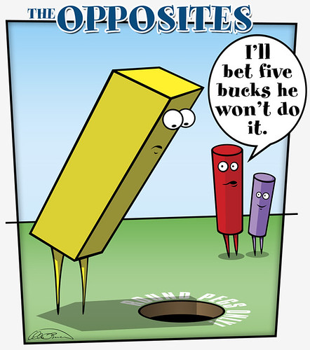
IF: "Opposites"
I'm still suffering from a bit of creative block. But I managed to get something done for "Opposites".
What's more, I took extensive screenshots of the process. The downside is I tracked so many stage that I don't have the energy to write out what I did during each one. Especially after setting up all of the images and putting together the code for the page.
It has so far taken me at least twice as long, if not longer, to just get the breakdown to the state it is now than it did to actually make the completed image. Ugh.
And to top it off, around stage 26 I noticed something that I'd never noticed on the Flickr image page before. Apparently, it's in the "Flickr Terms of Service that if you post a Flickr photo on an external website, the photo must link back to its photo page. (So, use Option 1.)"
I never use Option 1. Mainly because when I link a photo that is smaller than the original size, I want it to link to the original size when it's clicked on. That seems to be frowned on now.
By that point in the breakdown there was no way I was going to go back and change every one of the photos for all those stages, so for now I'll let it be. I have a feeling that I'll be migrating my site's image hosting back to SmugMug if Flickr tries to enforce this. For most stuff it won't matter too much if I use Option 1, however some things, like my header, would look stupid as hell linking back to Flickr.
Also, using Option 1 would keep me from doing nifty things like:
At some point this week I'll try to add in some text that explains just what you are looking at in the breakdown. Those of you familiar with Photoshop can probably figure it out.
Have a great week everyone! Comments are always welcome.


Comments
8^)
BTW that's a lot of screen shots.
I swear.
a great take on opposites!