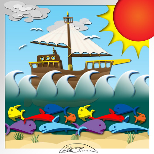
Illustration Friday: "Sea"

Derek was saying that he tends to get a large amount of visitors after posting his Illustration Friday" drawings, and it turns out that he posts his at the tail end of the week, so I decided to give this one its own post rather than appending it to the previous post. I don't want Ray to take more of a hit than expected.
For my first attempt, not too bad. I guess. I thought that the word that I would be doing was "flavor". It turns out that word expired on Thursday. Surprise! Still, considering I didn't have a concrete idea when I started I think it turned out well.
I built it in Photoshop. I wanted to get a 'cut paper' feel on this one. You can click on it to see a larger version. What do you think?
Comments
it could be the cover of a children's book, it could.
Lois: And it's a bit easier than actually using cut paper. And much cleaner.
Heather: I know. So unlike me, huh?
Valgalart: Thanks! I'm actually not that happy with the waves. Not quite what I had in mind.
Tony: Thank you,
Sea Angel: Thank you. It's not actually "my style"; at least not yet. In fact it's quite a departure from my normal style. I'm working at it though.
El Sid: Thanks! I wish I was able to use my skillz for good rather than evil, but good just doesn't pay as much. Not that evil fills my pockets to bulging or anything.
Don: Well, thanks! And certainly! I'll stick to this style for a while.